This card is so easy to create, and yet so stinkin’ beautiful! I saw this basic technique described on Instagram, and decided to recreate it using my gorgeous Stampin’ Up! Products.
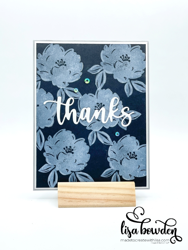
All we’re doing is basically creating a black and white card. But when you stamp with our White Pigment Ink Pad onto the Basic Black cardstock, it ends up looking gray. Isn’t that cool? Personally, I think it looks like chalk on a chalkboard. I love the look and think you could use lots of different images to make cool backgrounds. Actually, that is making me think. What about using our alphabet stamps to make a child’s card, so that it looks like a school chalkboard? However, maybe our kids don’t even know what real chalkboards are anymore…hahaha!
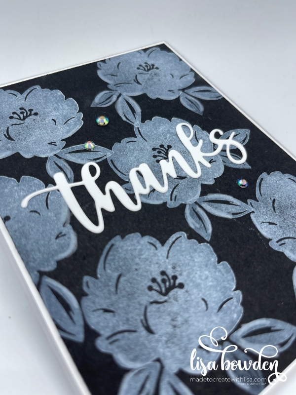
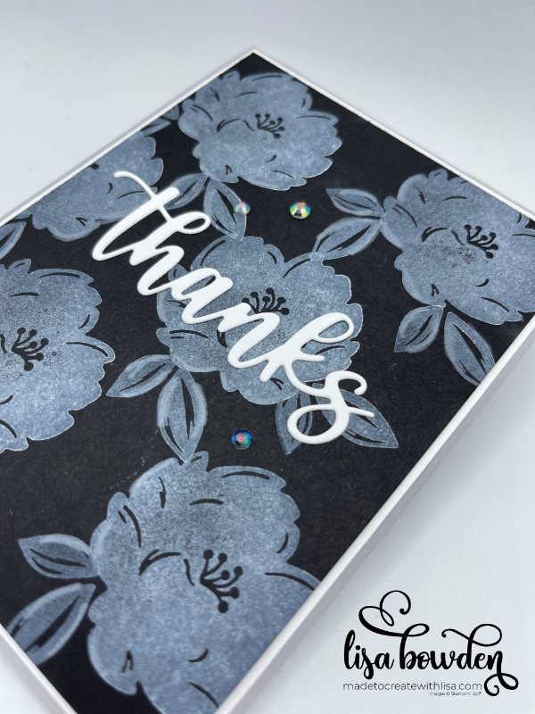
Anyway, all you need for this card is Basic Black cardstock and the White Pigment Ink Pad. Choose a stamp set that is bold, so that you can really see the grayscale technique come to life. Here, I used the Two-Tone Flora stamp set (which is beautiful, by the way!) and inked it up. Be sure to look at your stamp to make sure it’s nicely, heavily inked before stamping. You’ll need to ink it up again each time you stamp, and stamp all over the black card layer to create a floral background. After randomly stamping the flowers, I then added the greenery here and there to fill in some of the blank spots.
If you’re wondering, the answer is YES…the pigment ink does take some time to dry. Don’t touch it right away! If you want to speed up the drying process, you can use your Heat Tool. Otherwise, just be sure not to touch the ink and let it air dry for quite awhile.
The finishing touch for this card is the Amazing Thanks Dies, and I just cut out the word “Thanks” with Basic White cardstock. Now that I’m looking at it, I think that using our Shimmery White cardstock would be fantastic too, giving it some glitz! I also had someone comment on my video that I could have used the Positively Pink cardstock to make the sentiment pop, and I think definitely YES! Or Real Red? We’d better get busy and try out all of these ideas!
I sprinkled on a few gems, and the card was finished. Here, I used the Iridescent Pearl Basic Jewels. I love the Iridescent sparkle that they bring to the card. The gems would be another place you could bring a pop of color to the card if that’s what you’re looking for, but I wanted to leave mine black and white.
I’m going to link the video here so that you can watch how I made the card. I know the visual helps some people, instead of just describing it! It’s actually just basic stamps, ink, and paper. Not a difficult or intense technique at all!
So, are you going to give it a try? Let me know if you end up using one of the other color combinations and how it turns out! I bet they will all look fabulous. Have a beautiful day!
You can purchase the products I used:

")


")


Leave a Reply