Have you ever tried using our gorgeous, full-color catalogs for your card layout inspiration? You should!! Every single Stampin’ Up! catalog is full of amazing ideas that will inspire you every time you craft! Today, I used Page 1 of the Annual Catalog to inspire my card layout, and all I did was switch up the colors and change a few elements to make it my own. And I love the way it turned out!
PLEASE CLICK HERE to watch the video where I made this card. You can see exactly how I layered my colors with the Stampin’ Blends markers as I colored in the image!
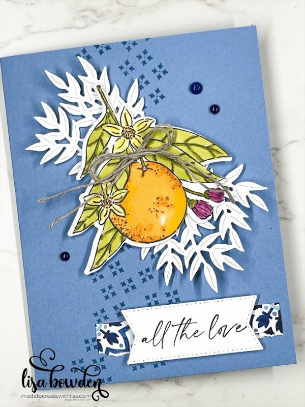
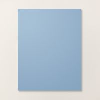
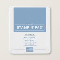
The base of my card is a piece of Boho Blue cardstock, measuring 8-1/2″ x 5-1/2″ and folded in half. Then, I used matching Boho Blue ink to stamp on the background stamp from the Citrus Blooms stamp set.
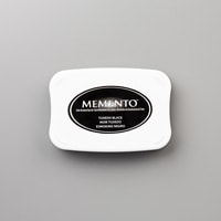
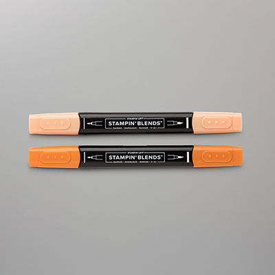
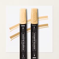
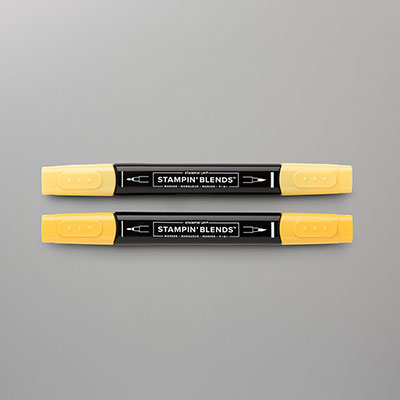
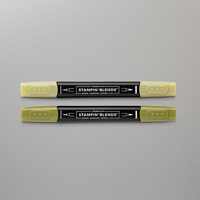
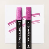
For the focal image, I stamped the orange image from the Citrus Blooms stamp set, using Black Memento ink, onto Basic White cardstock. I used my Stampin’ Blends alcohol-based markers to color it in, and I really love how it looks! I’ve never been very talented at coloring, and I’m always so pleased with how my art looks when I use these markers. I look like a pro! You’ve GOT to give them a try! I used Old Olive, Peach Pie, Pumpkin Pie, Daffodil Delight, and Berry Burst. Then, I cut out the image using the matching dies.
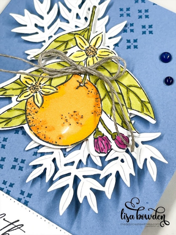
The leaf image is also from the Citrus Blooms dies, and if you watched the video, you know that I cut out only one image, but then cut it in half with my scissors to spread it out a bit. Once the orange image is layered on top, you don’t even know that the leaf was cut apart! I added the orange image onto the card base using Stampin’ Dimensionals.
I stamped the sentiment with Black Memento ink onto one of the banner dies from one of my favorite staples in my craft room: the Stylish Shapes dies. A must-have!!!
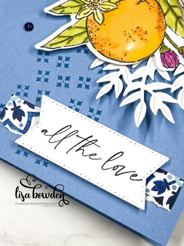
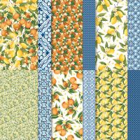
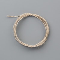
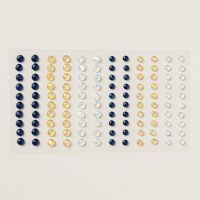
The final elements to the card are the little scrap of the Designer Series Paper that goes with this stamp set, called Mediterranean Blooms, that I tucked behind the sentiment. I also added a bow made out of our Linen Thread, and finally, I sprinkled on a few of the Opal Rounds Assortment gems.
What do you think? Which card do you like better…mine, or the one on Page 1 of the Annual Catalog? I hope I have inspired you to pull out your catalogs and get some fresh, new ideas!
Product List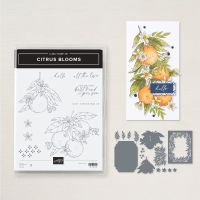



Leave a Reply