If you follow me at all, you know that I am the BIGGEST fan of printed paper! I use it almost every single time I craft. It is the easiest, and most beautiful, way to “step up” my projects with colorful images that I didn’t even have to create! It’s the best!
Today’s card uses 6 different prints of paper from the To Market Designer Series Paper (DSP) pack by Stampin’ Up!, and I love how they all coordinate and play off of each other to pull together a beautiful background for my card. PLEASE CLICK HERE to watch the video where I made this card, so that you can see exactly how I made it!
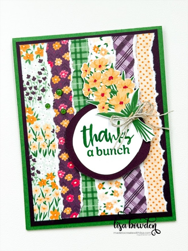
The card base is a piece of Garden Green cardstock, measuring 4-1/4″ x 11″ and folded in half. Layered on top of that is a piece of Blackberry Bliss cardstock, measuring 4″ x 5-1/4″. And finally, on top of that, I layered 6 strips of the DSP (all different prints), each of which measures 1″ x 5″. I took each strip, and tore off the right-hand side of them, and then layered them slightly overlapping one another. Once they’re all adhered to the card base, they create the coolest background for my card!
For the sentiment, I chose a stamp from the coordinating Market Goodness stamp set, and then die cut them out using the Around it All dies. These dies are new, and I LOVE them! They are wonky-shaped circles, and I love the playfulness that they bring to the project. The sentiment was stamped onto Basic White cardstock using Garden Green ink, and then this was layered onto a piece of Blackberry Bliss cardstock.
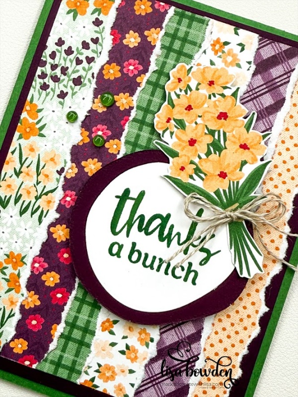
I hand-cut out a bouquet of flowers from the DSP pack, which looks so cute on this card, and then finished it off with a Linen Thread bow. Finally, I sprinkled on a few of the Transparent Dots, which go with this suite of products and fit perfectly with this project.
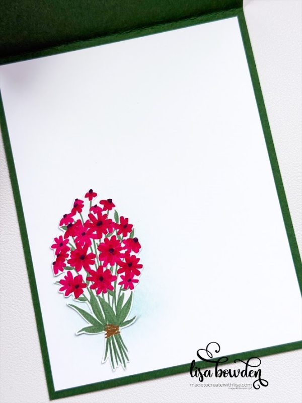
On the inside, I made a light “wash” of Pool Party ink on the bottom, left-hand corner, and then added another hand-cut bouquet of flowers. I like how the super light shadow of blue adds some warmth to the card, instead of just sticking the flowers on with no background. Can you see how it adds just a little “something?”
CLICK HERE to see another card I made a long time ago, using this same method of background. It’s more of a monotone blue-on-blue look, and it looks fantastic! This gives you a few different ideas for how to create this look on your own. Enjoy!
Product List")
 Designer Series Paper")


Love all your designs. Very creative
You’re so sweet! Thank you so much!!
Beautiful!
Thank you so much! I’m so glad you like it. These papers are really wonderful!
Just found your video with the to market dsp and tearing the paper. It’s very cool. I’m going to order this and try it. Thanks for sharing. Antoinette Toni Shilling
You’re so welcome!! It’s such a great paper pack…you’ll really enjoy it!!